What’s the Difference Between a $2,000 Logo and a $20 Logo?
At its core, a logo appears to be a simple thing: it’s a mark, a graphic, or a design that is consistently used to promote public recognition for a company and its products and services. The process of creating a logo is not a simple thing. What’s the difference between a $2,000 logo and a $20 logo? The answer is not (just) $1,980.
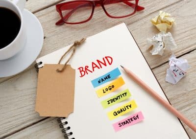
To be effective, a logo must be unique. In last month’s column, I discussed branding: what it is, and what it isn’t. Your logo is not your brand, but rather a tool that visually represents your brand. When designed and executed properly, a logo (or even elements of it) will stand on its own to represent your organization.
What comes to mind when you hear the following words: golden arches, swoosh, bullseye? I bet you are now thinking of McDonald’s, Nike and Target, and you have their logos on your mind. You may be thinking of the colors, the shape and how you personally feel about each company.
When you purchase a low-cost logo through a service like Fiverr or 99 Designs, you are often purchasing a design and little more. Those designs may incorporate stock design elements. As a result, they are not unique. The design process used by these designers often does not include thorough brand research or competitive analysis. Your logo is an important part of your overall brand. It is much more than a pretty picture developed in colors you like. A logo design is an investment, and you should profit from it. It should help you built your brand, attract your target clients and set you apart from your competition.
What should the logo development process look like? I advocate for the following approach:
Stage 1 – Discovery:
The first step in logo design is the discovery phase. A logo design should not begin until you have met with a design team to describe your vision for your organization. You should be asked about your company goals, your products and services, your target market and your unique selling position. You and your designer should discuss existing logos, fonts, and colors that speak to how you aim to have your company positioned and known.
Stage 2 – Draft Concept:
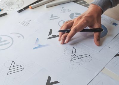
Using information gathered from the discovery meeting, research is conducted by the design team to examine the competitive landscape and your industry to ensure initial design ideas are unique. You should be provided with two or three concept options without color. These draft designs provide the opportunity for you to provide your initial feedback to ensure the design team is working in the right direction to execute your vision.
Stage 3 – Concept Development:
Concept Development follows. At this stage, you will have a single logo design option with color presented in multiple ways (such as on business cards, t-shirts, and marketing collateral). This activity allows you to get a better feel for the overall brand. You will be asked in this meeting for any final adjustments desired to perfect your logo. There are several things you should consider before approving your design concept. Will the logo scale up and down well? There may be times your logo has to be used in small places. Will it still be legible and recognizable if it is shrunk down? If the logo is laid out horizontally, will a vertical version be provided as well for use when wide logos are difficult to use? How will the logo look on a colored background? How will it look when used around other images?
Stage 4 – Final Revisions / Approval / Delivery:
During this stage, final revisions are incorporated into the concept and approval is obtained. Upon approval, you should receive several deliverables including a branding guide and the logo in multiple formats. Always ensure you receive a vector file of your design. A vector file is a high resolution, scalable version of your image that can be blown up for use on signs, billboard, etc. without diminishing the quality of your logo’s appearance.
Logo development is a process that is only becoming more complicated as our digital and global marketplace get noisier and more crowded. In 1971, Nike paid only $35 for their logo design with founder, Phil Knight, reportedly responding to the initial design by saying, “I don’t love it, but maybe it’ll grow on me.” In 1995 the Nike logo underwent a slight modification to its original design in exchange for $600,000 worth of Nike stock. The process does not have to be expensive, but it does have to well thought out. You will always be better served by professionals who see logo creation as the more than the development of a pretty picture.


